Marco Polo by Nathan
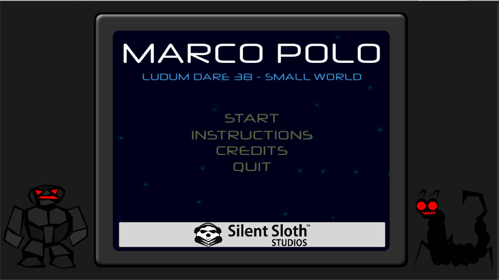
Game Download/Play Location: https://rambauldi.itch.io/marco-polo
Ludum Dare Submission Page: https://ldjam.com/events/ludum-dare/38/marco-polo
FOR THE NIGHT IS DARK AND FULL OF TERRORS!
Marco Polo is a classic point-and-click style game where you must save your child and escape the indescribable terrors of the world you have crashed on. Armed with only a flashlight, your voice and your unmatched wit and cunning - you must traverse the terrain of this small world, find your child and make a hasty exit. But your ship is badly damaged from the crash, how can you escape? How can you find your child? At least you have a way of communicating with them using that childhood game, we all know and love.
All artwork and sound effects brutally, and savagely, created by our good selves, you are in for a fun ride.
Say hi to Freddy for me.
The Silent Sloth Studios Team
Opt Outs:
Only the background music and font were not created by us, but with permissions to use!
| Original URL | https://ldjam.com/events/ludum-dare/38/marco-polo |
Ratings
| Overall | 657th | 2.846⭐ | 28🧑⚖️ |
| Fun | 615th | 2.692⭐ | 28🧑⚖️ |
| Innovation | 552th | 2.808⭐ | 28🧑⚖️ |
| Theme | 692th | 2.577⭐ | 28🧑⚖️ |
| Graphics | 700th | 2.269⭐ | 28🧑⚖️ |
| Humor | 401th | 2.542⭐ | 26🧑⚖️ |
| Mood | 243th | 3.5⭐ | 28🧑⚖️ |
| Given | 38🗳️ | 44🗨️ |
I am also a little confused on your opt outs. Are you opting out of audio or are we just ignoring the music when judging?
folder next to the executable" shows up!
folder next to the executable" shows up!
I thought the story bits were well written and entertaining, although I'm not a fan of the font choice. Although the font might fit with the game's theme, it's not that easy to read. Given the amount of text I would definitely choose readability over style.
I found the monster encounters frustrating. It did not feel like you were given a fair amount of time to run. Running in a point and click didn't feel like a natural response - perhaps because you have limited control of your movement speed and direction. I would have preferred another way of evading such as distracting them with an object.
The voice mechanic was an interesting and a nice touch, although I think it might have worked even better in a 3D environment (with directional 3D sound).
The one speaker issue - you know, that is probably how i exported the audio. I do like your idea of using positional sound as a potential update, but we finished what we could in the time, and the one speaker issue (since it was not intended to indicate direction) is not game breaking, so i will have to leave it til post-jam.
The opts-outs, i will admit, i am not clear on this, in terms of rules, the sound effects were all made by us but the background music was not, so i was not sure if we OK to stay in. So i will do the fairer thing and just opt us out of sound.
I can guarantee you that the escape pod is fixable. There are a number of references, in the instructions, the panel itself to give you a clue on this.
Thanks again for the feedback, hopefully these comments help and you will give it another go and see if you can complete!
We had actually gone for an intentionally simple art style - we had an unexpected drop from the team at the 11th hour, so one of our coders jumped in to take that on, and we wanted something that, if needed, others could easily replicate throughout development.
I absolutely take your points mentioned - During development, we had discussions about a better way to handle the terror encounters, we did want a more interactive process there, but in the end, time bested us. Once you get used to the areas and the exit points, you can escape, but we didnt want to make it TOO easy, we probably erred a little TOO much on the difficult in the end. Good point on the font and readability, something we will keep in mind for next time!
Thanks again.
I liked how u implemented the game of Marco Polo into a space spooky game.
I LOVED the sounds that you use to say Marco and Polo! Cracked me up!
It would have been nice to implement a way see the instruction on how to play the game. There were times that i would forget how to do certain commands and actions.
Overall really like the originality and sound of the game!
And if you can, check out my game! https://ldjam.com/events/ludum-dare/38/soleil
You know, games and art are languages, ways of communication. Although I can understand what you say, most people don't without a polished work. And that's why I actually think you guys **must** try to polish this. Because it has potential, but almost no one can see it right now.
P.S.: that centipede scared the hell out of me. Sorry, but THANK HEAVENS THE ART WAS MADE BY YOUR PROGRAMMER! I don't even want to imagine my heartbeat rate if this was a polished piece!
Thank you for dedicating some time to my prototype.
I'll be honest: A lot of the hot-spots for movement drove me completely batty. As an example, I thought I figured out that to get out from looking behind rocks It was kinda upper left. Then I hit one that had the 'move back' spot in the upper middle. The hot-spots for the wires in the ship were incredibly odd as well.
Thanks again!
The map was a little hard to navigate and I wasn't always entirely sure what it was that I was looking at, but it's certainly nice to see a point and click game this LD!
The music fit really well and congrats on being the first game this LD to actually make me jump. :P
Keep at it!
-Skruffye
I have to agree earlier commenter that the action in point’n’click game isn’t the best possible solution and given the tiny amount of time you have to react (and find a hotspot on screen) doesn’t help. The marco-polo mechanic is cool. I didn’t get to use much as I died constantly.
Music and sound really make the mood. Voices are bit rough, but overall sounds are great.
Visuals have couple big flaws in them. Typography needs some serious rework, game with this much text (intro, instructions, in game messages) needs to have great legibility. Font you chose for the longer texts is nice, but doesn’t have the best readability. Longer texts should be always aligned or justified to left, centered text only for couple of sentences. Combination of green text on blue background is really awful color combination. The first screen of the actual gameplay is really confusing. I got lost outside constantly as point of view get changing between looking back and and forward. Compositions on most of the backgrounds need rethinking, clear focus on exits and important hotspots.
Although my feedback sounds really negative, I actually enjoyed playing this. With some work this could become really atmospheric and interesting title.