CG Petrel MK II Simulator by Dagegen
Description:
Explore the joy of long distance space travel yourself.
Fly the iconic CG Petrel MK II.
Use its supreme maneuverability to dodge space-obstacles.
Manage a challenging ressource distribution system.
Master the advanced solar panel calibration.
Controlls:
Keyboard and Mouse.
Instructions in Game.
Tools:
Unity 5.5
Photoshop
Bfxr
Ratings
| Overall | 607th | 2.667⭐ | 20🧑⚖️ |
| Fun | 587th | 2.5⭐ | 20🧑⚖️ |
| Innovation | 408th | 2.944⭐ | 20🧑⚖️ |
| Theme | 426th | 3.333⭐ | 20🧑⚖️ |
| Graphics | 560th | 2.5⭐ | 20🧑⚖️ |
| Mood | 469th | 2.611⭐ | 20🧑⚖️ |
| Given | 27🗳️ | 0🗨️ |
I know you still put a lot of effort into this, so please do not take my critique too much to heart, keep making games and they will improve, keep up the good work!
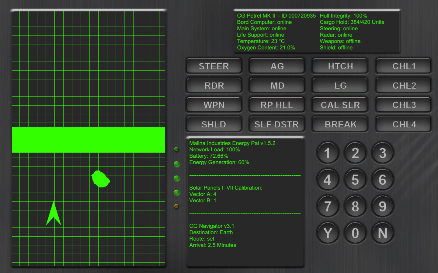
The monitor in the upper right tells which systems are active.
The function of most of the buttons is practically impossible to work out...
I'm sure you have a bunch of ways in mind to improve this game but these would be my suggestions:
* Make the radar actually graphically change the display, maybe don't show the grid without it, or have some other visual indicator that it's enabled. I didn't connect the presence of any visible data with the radar button (though in hindsight and with your comment it's obvious)
* Simplify the UI; I recognize the appeal in having a super complex looking UI, but there are tricks you can use to make a complex UI that's still easy to navigate. Highlighting the color of important buttons is a good option. Self destruct out in the open looking like any other button is something no UI designer should do. :)
* Going with the above, just don't rely on the human capacity to read and understand a lot of complex instructions. You can only reliably remember at most 2-3 complex ideas that you're not familiar with (this is why it's useful to playtest, because when you've built the systems, you are SUPER familiar with them and it doesn't register how much cognitive load you are forcing on your player) - If you can demonstrate or provide repetition for your mechanics, it will start to become intuitive and players will pick it up naturally.
I played this on stream at https://www.twitch.tv/videos/163826993 - Timestamp 0:03:00
It is hard to detect what systems are currently on/off.
You have to read each time. It would be cool if offline systems highlighted with red color.
:metal: **Overall: 3, Fun: 5, Innovation:2, Theme: 5, Graphics: 2, Mood: 3**
I like the coordination challenge, and you applied it to a very simple and known minigame, but the challenge itself might be a bit too cryptic. Otherwise, I always like to see original ideas, and you've definitely got one here. The graphics style is wisely chosen and the UI is intuitive. Nice work! :)
__ + __ Feel like controlling a complex ship
__ + __ UI theme, mood
** What imo could be improved **
__ - __ Clarity of UI
__ - __ Is it actually possible de refill the battery ? Victory condition was not very clear
__ - __ Adding some space atmospheric music + realistic sounds would have fit your graphics better I think
** Overall **
Enjoyed the play even if it was not easy to figure out how to play, good work on it ! Thanks for the game =)
Since we have to look at the radar, think that it's easier for the player to trust in his/her peripheral than to look for textual information on a display. ;)
The game, though, with its mechanics, has some really great work done, so Good Job! ;)