Sacrificial Cards by Howard Duong
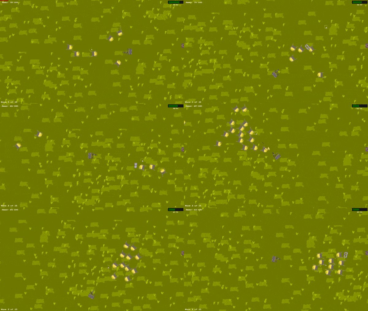
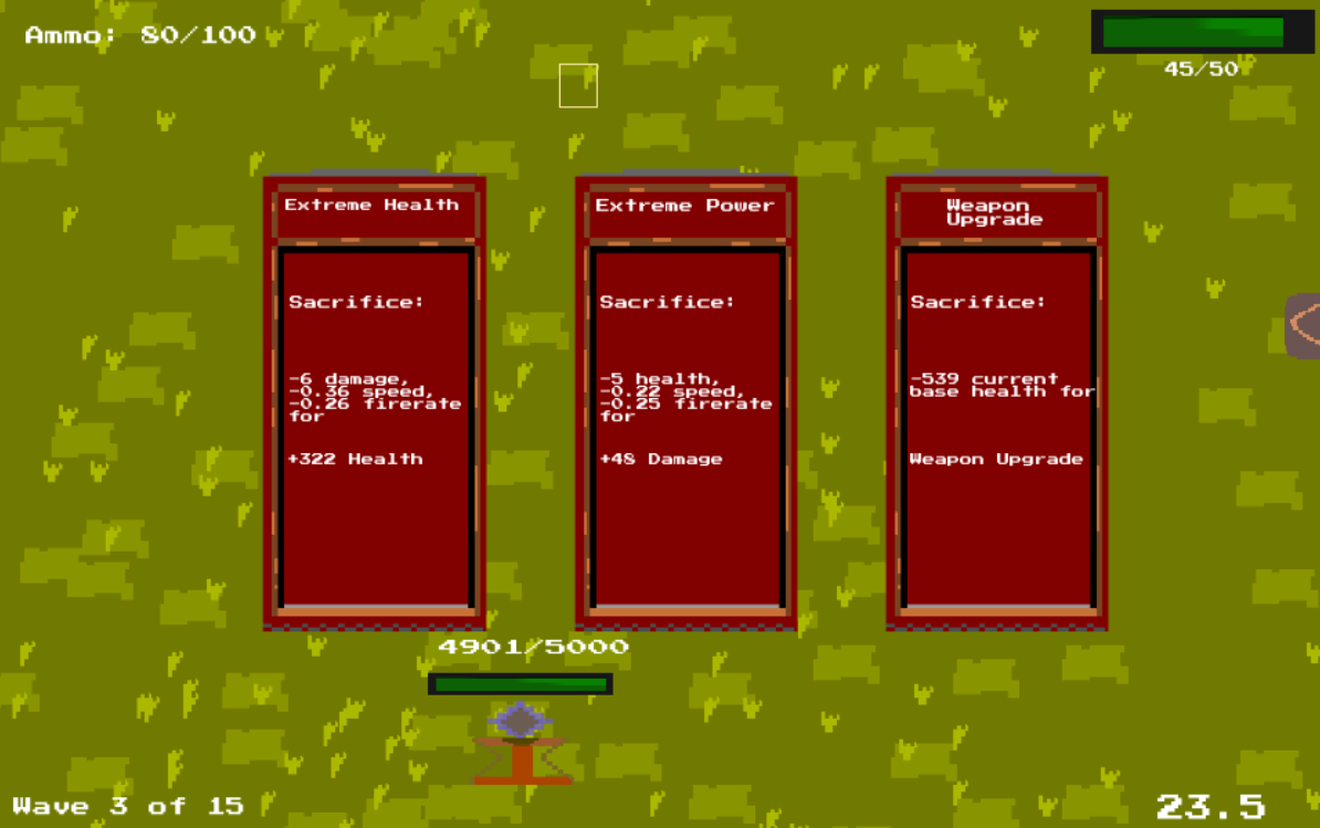
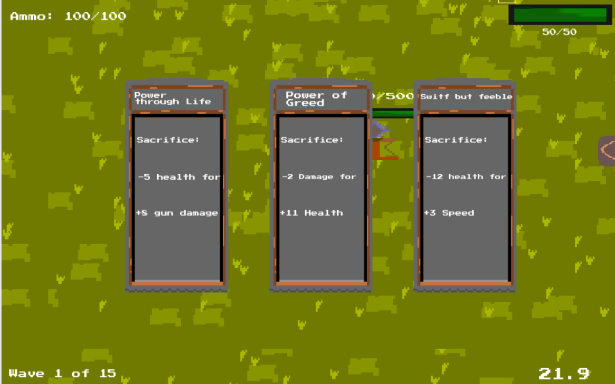 Choose a card, then protect the beacon and survive!
How does it work? You will be presented with three random cards at the beginning of every wave. Strategize your picking so that you are able to win the harder waves.
Control: - W,A,S,D to move - Hold Left Mouse to fire gun - R to reload - Click arrow on the right to see stat
Ratings
| Overall | 566th | 3.375⭐ | 22🧑⚖️ |
| Fun | 382th | 3.425⭐ | 22🧑⚖️ |
| Innovation | 555th | 3.1⭐ | 22🧑⚖️ |
| Theme | 446th | 3.575⭐ | 22🧑⚖️ |
| Graphics | 878th | 2.625⭐ | 22🧑⚖️ |
| Humor | 655th | 2.563⭐ | 18🧑⚖️ |
| Mood | 808th | 2.895⭐ | 21🧑⚖️ |
| Given | 21🗳️ | 18🗨️ |
As others have pointed out, there is a lack of contrast between characters and the background. The patterns on the background are also rather distracting and need to be more subtle.
The health bar also looks like a stretched graphic. Compared to the clean pixel art of the other graphics, the pale green pixels of the bar seem to be have some stretching on them causing a blurry gradient which looks unintended with the art style. The art in general isn't very pleasing to look at. I would suggest if you are going for pixel art or emulating its feel, try looking at some tutorials on pixel art and its appeal, and practice with having a certain style. The choice of colour palette can also dramatically improve your visuals as here everything just seems to blend together and nothing really stands out. Great colours can make your graphics pop out from the screen but right now I'm not really feeling excited by the graphics.
I'm happy to see that some basic visuals of shooting were added - muzzle flash when shooting is nice, and a tiny impact sprite lets me know that my projectile has hit an enemy. These are little stuff but it matters in a game :D You could take this further by having some blood splatter or some effect when an enemy dies, instead of them disappearing completely like as though they weren't there.
In terms of gameplay, I liked the concept of having to sacrifice certain stats for others, while generally still improving the character so you still feel a sense of progression. Having music and sound effects also helps the immersion of the game.
I notice that at the end screen, the texts seem to blur when they are hovered over and scaled up, leading to a pixelation of the font. The background used for the ending screen also seems extremely pixelated, as though it was the background but scaled up by a few times. This pixelation is inconsistent with the text which makes the whole screen very jarring to look at.
Lastly, the arrow to view the stats isn't very obvious nor does the graphic on the button give information on what it is for so it felt rather out of place. It also was one of the last things I discovered in the game because of its obscure location and colour. Furthermore, I think it would be nice if the stats of the weapon and character are actually displayed by default on the screen every time the cards come up. That way we know that the stats screen exists, but also more importantly we are able to make a comparison on how the values of the stats scale. Does 2 damage matter when I have 20 damage? I was also confused when sudenly the cards were now referring to the center weapon, instead of the character, and now the values were completely different, with high values like 400HP etc. The only way I understood it was that my character only had 50 HP so there was no way I could spend 400HP.
Nevertheless, great job at making this game. It is a wonderful concept and I hope you continue practising to make more games! :)