PolyFury by Dom Harris
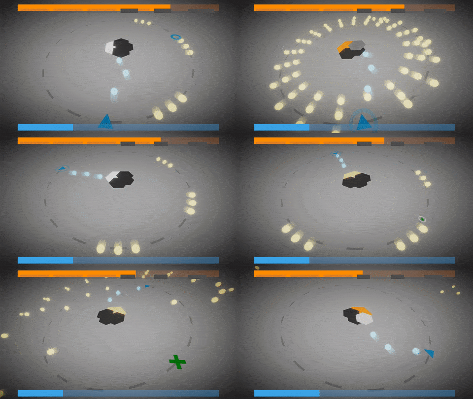
Take your anger out on this stupid hexagon. Who needs that many edges, anyway?
Edit: There's a postmortem for you to read!
Audio by the excellent Deagle
https://www.youtube.com/watch?v=ZkKFZKsV8_c
Made in roughly 15-20 hours, I didn't have a huge amount of time this year, which is why I didn't enter the compo. Enjoy!
The font is: Josefin Sans
I used Freya Holmer's Shapes, which I guess technically is a graphics library - but all of the graphics still needed configuring, so I'm not opting out of that category. The look and feel is all me, baby!
I also used DOTween because who starts a Unity project without a tweening library :joy:
Ratings
| Overall | 350th | 3.843⭐ | 53🧑⚖️ |
| Fun | 217th | 3.892⭐ | 53🧑⚖️ |
| Innovation | 843th | 3.298⭐ | 54🧑⚖️ |
| Theme | 643th | 3.769⭐ | 54🧑⚖️ |
| Graphics | 484th | 3.906⭐ | 55🧑⚖️ |
| Audio | 328th | 3.745⭐ | 53🧑⚖️ |
| Given | 15🗳️ | 24🗨️ |
But for feedback I also do feel that movement could use some more tweaking as it felt to me as if it was to fast.
I was a bit confused the first time I played about if there was a health indicator, and it was hard noticing it because the game just kept throwing stuff at me and it was very subtle. I didn't see the controls anywhere either, so I hope it was just A, D, Space, and I didn't miss anything.
The movement deceleration felt a bit too slow, which made it hard to precisely control when the tight bullet pattern appeared. Being inverted at the top threw me off a bit, so I mostly stayed at the bottom of the loop. It'd be interesting if there were bullet patterns or anything else that forced you to go around the entire loop.
I went into the settings and saw music and effects volume controls, but there was no music or sound there to test different settings.
- good basic framework for a game
- down sides
- Menus have no hover/selected effect
- audio sliders don't 'beep' to let you know what the new setting is for volume level
- the movement was a bit sensitive, was really hard to get the exact position I wanted to be in
The only thing I think could be clearer is the upgrades and what they do (so the player can choose wether to pick it up).
The menus are a bit bland but most games on here don't even have menus so i'll definitely mark you up rather than down for giving us the option to change volume!
I didn't find if there was a quit button from within the game other than Alt+F4? :grimacing:
The movement seemed quite fast at first but I managed to win on my second play and it was a close win - so i'd say the difficulty was almost perfect for me. The camera and other little effects (tilting etc) probably made it feel even more exciting and were clever additions :thumbsup:
Music and sound effects were very apt - they worked well!
Congrats on making this in such a short amount of time too! Not even using the full compo time :grin: :clap:
first of all, the audio is pretty clean and i like the choice of colors and the presentation in general. the game poses some challenge, which is always fun. also, some bullet patterns are fancy and well thought, which takes some work, not going to lie.
but some things made the experience itself a little bit awkward. first, the circle-wise movement, combined with the screen shake that always happens whenever you move. and the movement is way too fast sometimes, which makes it hard to micro dodge. a suggestion to improve this: implementing a "focus on shift", like some bullet hell games normally do, so you can move slower while holding shift.
the 3d perspective makes it hard to "read" the bullets in advance when the player is not close to the camera.
overall i get why some people could potentially like this, but the mechanics felt way too awkward for me. i rated giving it the benefit of the doubt and admitting that it's maybe just me in particular who didn't have such a good experience, and recognizing the game for what you guys have done right.
Still, I like how the game is straight forward and how I immediatly got into it, I believe that with a bit more polish and some cool visual effects, you can get a very nice prototype ! You should keep on working on it at least a bit :)
Player control is abit off.
Overall simple and fun, good luck!
Controls were to much brutal ( something with player speed or i don't know ) so it was difficult to play.
Some explanations about was is the health bar, controls, would be appreciated.
But overwall it was great ( just fix the controls and perfect for me )
I think you should add some instructions to the game page though. I love the minimalist UI, but it's really weird to find out what the health bars are.
Thanks for linking us your game! Overall, I had a fun time playing it, I really liked the minimalist visual choices as well as the simple concept. There are just 2 things that I kind of struggled with: as said by other players, the controls were a bit "sharp" and abrupt, sometimes it was tricky to avoid the shots. The other thing is about UI, I was having a hard time searching for a feedback about my health and avoiding the shots 😆 . Overall, there are just a few things to adjust to make it even more enjoyable. Really good entry! Congrats
Cheers 💜
The game play loop itself worked as well for me. The power ups were a nice addition to spice things up and the enemy even has different attack patterns to look out for. The game is rather short, I would've loved to see additional bosses with more variations :) But of course in a jam context, stuff has to be dropped at some point.
My only issue were with the controls. I don't know if it was just for me, but i run a 144hz setup and the controls were SUPER sensitive. Way too sensitive for a bullet hell style game. Making small adjustments to my position were impossible that way. That thing flew through the loop in a split second after touching the inputs.
Other than that, a very solid entry. Good job!
Maybe the life circle should start depleting in front of the camera instead of on the other side, at my first run I did not understand where I was supposed to see my hp.
Other than that, I liked the geometric aesthetic and it was tense and fast paced, well done !
I liked the simple shapes, they are easy to read! Freya's library is the best!
Yeah, a bit unfortunate that their's only that one level, but at least that one level was of top quality! Thanks!
Still, there are a few things I want to say about it.
The bullet patterns were really good and had a great amount of diversity to them. I also liked how you had to systematically remove armor from the boss. Gave it a little depth as well.
However, due to the perspective it kind of made it a little hard to judge whether I would get hit by certain bullets or not. This problem was present mostly if I was at the furthest from the camera.
A little more visual feedback for when you get hit or when you're regaining health from the green powerup would go a long way as well.
The representation of the healthbars were really cool. I loved their visual design. In fact if you continue with this game, keep the visual design as simple as this and maybe change up the pallete here and there. I loved it and would like to see more.
Really fun entry man. Thanks for telling me about it :)