Main Menu (aka; Typography HELL)
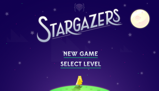
I spent forever trying to figure out what kind of typography is best for our game’s titlehead. It’s going to be on all marketing material, so I really wanted it to be impactful in some way while still staying clean and aesthetically similar.
In short: I took way too much time doing this. But at least the main menu looks pretty nice I guess.
This was an earlier iteration of the title I made. I liked it, but it didn’t quite work…
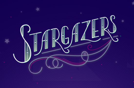
in short, I spent way too much time on these. Now, to other work!
Tags: LD#26